Heavyweight Graphic Tee Review for Real Work
Dela
A heavyweight graphic tee review should start where most product pages stop: with the shirt in your hands, not folded under studio lighting. A tee can have a clever print, a respectable size chart, and enough marketing copy to fill a corrective action report. None of that matters if the collar turns into a bacon strip, the fabric goes thin after a season, or the graphic starts shedding ink after three wash cycles.
For engineers, machinists, and manufacturing people, a graphic tee is not usually a costume. It is off-shift gear, shop-floor casual wear, a decent Friday shirt, or a gift that needs to prove the buyer actually understands the job. The standard is not runway fashion. The standard is simple: does it feel substantial, fit predictably, and survive normal use without looking like a failed prototype?
What Makes a Tee Heavyweight?
"Heavyweight" is often used loosely, which is convenient for sellers and useless for buyers. In practical terms, heavyweight usually refers to a higher fabric weight than the standard lightweight retail tee. Fabric weight is commonly measured in ounces per square yard. A typical lightweight shirt may land around 4 to 4.5 ounces. Midweight tees often sit near 5 to 6 ounces. A true heavyweight tee generally starts around 6 ounces and can go higher.
That number does not tell the whole story, but it changes the baseline. More material usually means better opacity, a more structured drape, and a shirt that does not cling to every contour after an hour in a warm building. It also tends to feel more durable at the shoulders, collar, and torso - the places where cheap tees reveal their cost first.
Heavier is not automatically better. A 7-ounce shirt can be excellent for a cool machine shop, a weekend project, or regular casual wear. It can also feel like unnecessary insulation in July if you work in an unconditioned facility. The right weight depends on climate, use, and how much you value structure over airflow.
Heavyweight Graphic Tee Review: The Tests That Matter
A good evaluation goes beyond touching the fabric once and declaring it premium. The real performance shows up in construction, print behavior, shrinkage, and fit after laundering.
Fabric feel and structure
The first useful test is whether the tee has body without feeling like cardboard. Quality heavyweight cotton should feel dense and stable, but it should still flex at the shoulders and soften with wear. The fabric should hang cleanly instead of collapsing around the chest or twisting down the side seams.
Look closely at the knit. A tighter, more even surface generally supports sharper printing and wears more consistently. Slub texture can be intentional, but random thin spots are not character. They are variation that will become a hole or a transparency issue later.
A heavyweight tee also earns its name through opacity. Hold it to light. You should not get an unintended inspection report on whatever is underneath. This matters especially with light colors and larger sizes, where bargain blanks often become noticeably thinner.
Collar recovery
The collar is the component most likely to announce that a tee was built to a price point. A heavier rib knit, properly attached, should lie flat and return to shape after being pulled over your head. It should not curl upward, stretch wide, or look exhausted before the body fabric has even broken in.
This is not a cosmetic detail. A blown-out collar makes an otherwise good shirt look disposable. It is the apparel equivalent of a part that meets nominal dimensions but fails in the assembly.
Seams and stitching
Check the shoulder seams, sleeve hems, and bottom hem. They should be even, secure, and free of skipped stitches or loose thread tails. Side seams should run straight. If they begin rotating around the torso after a wash, the garment was likely cut or finished without much control.
Shoulder-to-shoulder taping is a worthwhile detail on many heavyweight tees because it reinforces a high-stress area and helps the shirt maintain its shape. It is not a guarantee of quality by itself, but its absence is worth noticing when a brand is claiming a work-ready garment.
Print quality is more than sharp lines
For a graphic tee, the print is part of the product, not decoration added after the fact. Fine details need to remain readable. Solid sections should be consistent. Ink should not feel like a thick plastic plate sitting on top of the shirt, especially across a large chest print.
There is a trade-off here. A very soft print may use less ink and feel better on the body, but it can appear less saturated on dark garments. A heavier deposit can deliver stronger color and sharper contrast, yet feel stiffer until it has been washed a few times. Neither approach is automatically wrong. What matters is whether the print method suits the design and the garment.
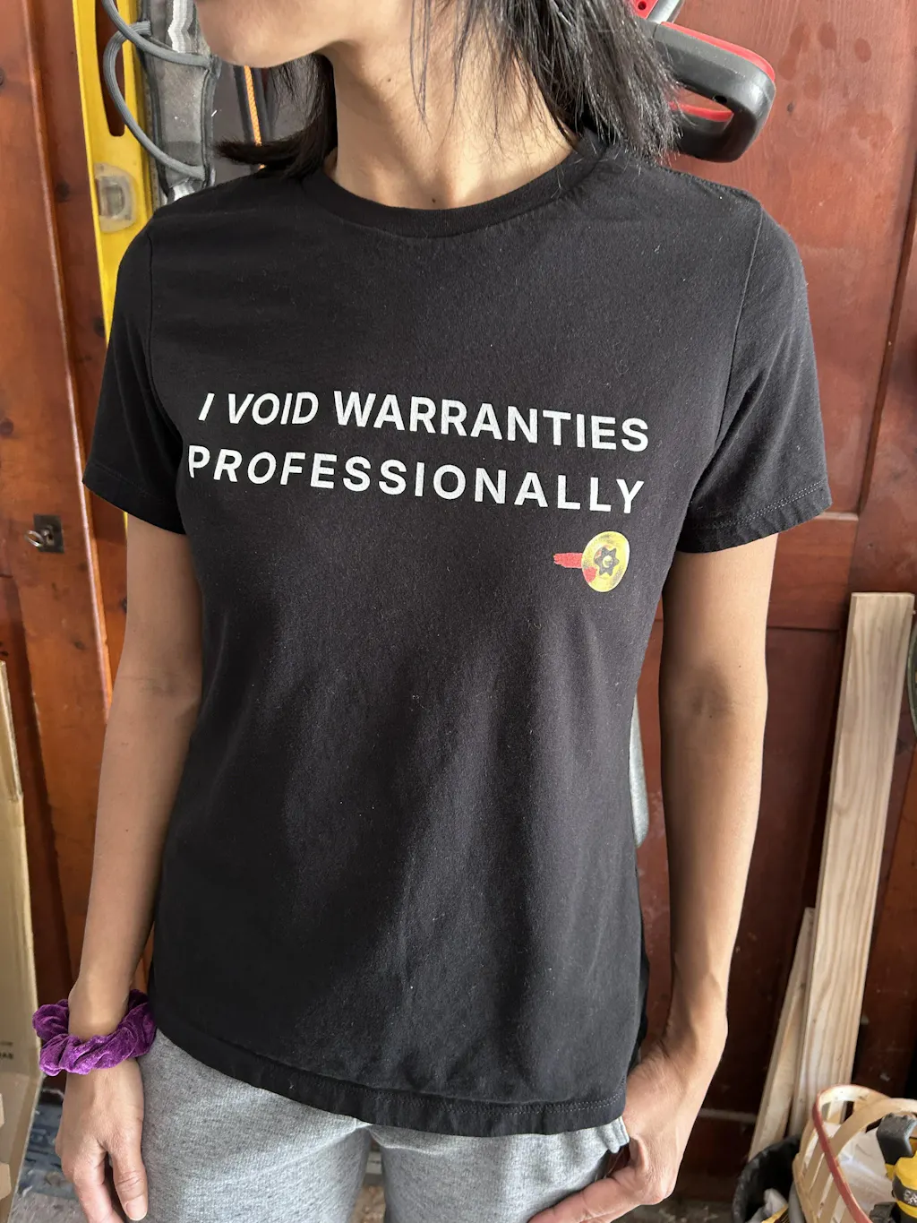
Industry-literate graphics raise the bar further. A machining, quality, or engineering reference needs to be correct enough that the people who live with those terms every day do not have to explain the joke. Generic gears and random equations are easy. A design that makes sense to someone who has been through a CAPA review or chased a tolerance stack is harder to fake.
The Wash Test Is the Real Qualification Run
The first wash is where many shirts move from promise to evidence. Follow the care label, preferably using cold water and turning the shirt inside out. Then inspect four things: shrinkage, twist, collar shape, and print condition.
Some shrinkage is normal with cotton, particularly if the tee is not pre-shrunk. The concern is excessive or uneven shrinkage. A shirt that loses substantial length while barely changing in width can turn a previously correct fit into an awkward one. A shirt that shrinks unpredictably has a sizing problem, even if the original measurements looked fine.
Twisting is equally frustrating. If the side seam migrates toward the front after washing, the garment will never hang right again. That is not just annoying during wear. It is evidence that the fabric and cut were not controlled well enough to maintain alignment.
For the graphic, inspect edges and dense ink areas after multiple wash cycles. Cracking, flaking, and loss of detail are red flags. Mild softening is normal. A good print should settle into the fabric over time, not abandon it.
Drying matters. High heat is harsh on cotton fibers, collars, and printed ink. If you want the maximum service life from a heavyweight tee, wash cold, turn it inside out, and either tumble dry low or hang dry. That is not precious garment handling. It is basic prevention for a product you expect to keep.
Fit: Room to Move, Not Room to Disappear
Heavyweight tees often fit differently than thin retail shirts because the fabric has more structure. A relaxed fit can look intentional on a dense blank. The same cut in a flimsy fabric can look oversized in the wrong way.
The best fit depends on how you wear it. If you want a clean casual shirt for an office, lab, or customer visit, prioritize shoulder alignment and a body length that stays below the belt when you reach or sit. If the tee is for weekends in the garage or under a hoodie, a little extra room through the chest and sleeves is practical.
Do not size based only on a label. Compare the garment measurements to a tee you already own and wear regularly. Chest width and body length tell you more than whether the tag says medium or large. This is especially useful if you are between sizes, prefer a longer torso, or know you will dry the shirt in a machine.
A fit should allow motion without turning the graphic into a distortion test. If a chest print stretches hard when you reach forward, you may need more room. If the shoulders drop halfway down your upper arms, the shirt may be too large unless that is the intended cut.
When a Heavyweight Tee Is Worth the Extra Cost
A heavier tee costs more because there is more material, often more substantial construction, and less room to hide poor finishing. The premium makes sense when the garment has a print you actually want to wear repeatedly, a fit you trust, and enough durability to outlast a stack of cheap shirts.
It makes less sense if you only need a throwaway event shirt or live somewhere hot enough that dense cotton will spend most of its life in a drawer. In that case, a well-made midweight tee may be the smarter engineering choice. Specification should follow application.
For niche professional apparel, the value also includes whether the design earns its place. A technically accurate graphic can start conversations with the right people without broadcasting generic STEM merchandise to everyone else. That is the lane grabNade is built for: designs that read differently when you have actually run the machine, modeled the part, or written the report.
The Verdict Depends on What You Expect It to Do
The best heavyweight graphic tee is not the stiffest, thickest shirt available. It is the one with enough fabric to hold its shape, enough construction quality to survive routine washing, and a print that still looks intentional after real use. Add a graphic with actual shop-floor or engineering context, and it becomes more than another black tee with a slogan.
Buy for the work your shirt needs to do. Check the fabric weight, study the measurements, respect the wash instructions, and give the collar and print the same attention you would give any other component expected to last. A shirt does not need to be complicated. It just needs to be built like someone cared about the tolerances.
Designs engineers actually wear
- Mechanical Engineer Definition: solves stealth defects with silent genius
- Root Cause CAPA Approved: here for the root cause, not the excuses
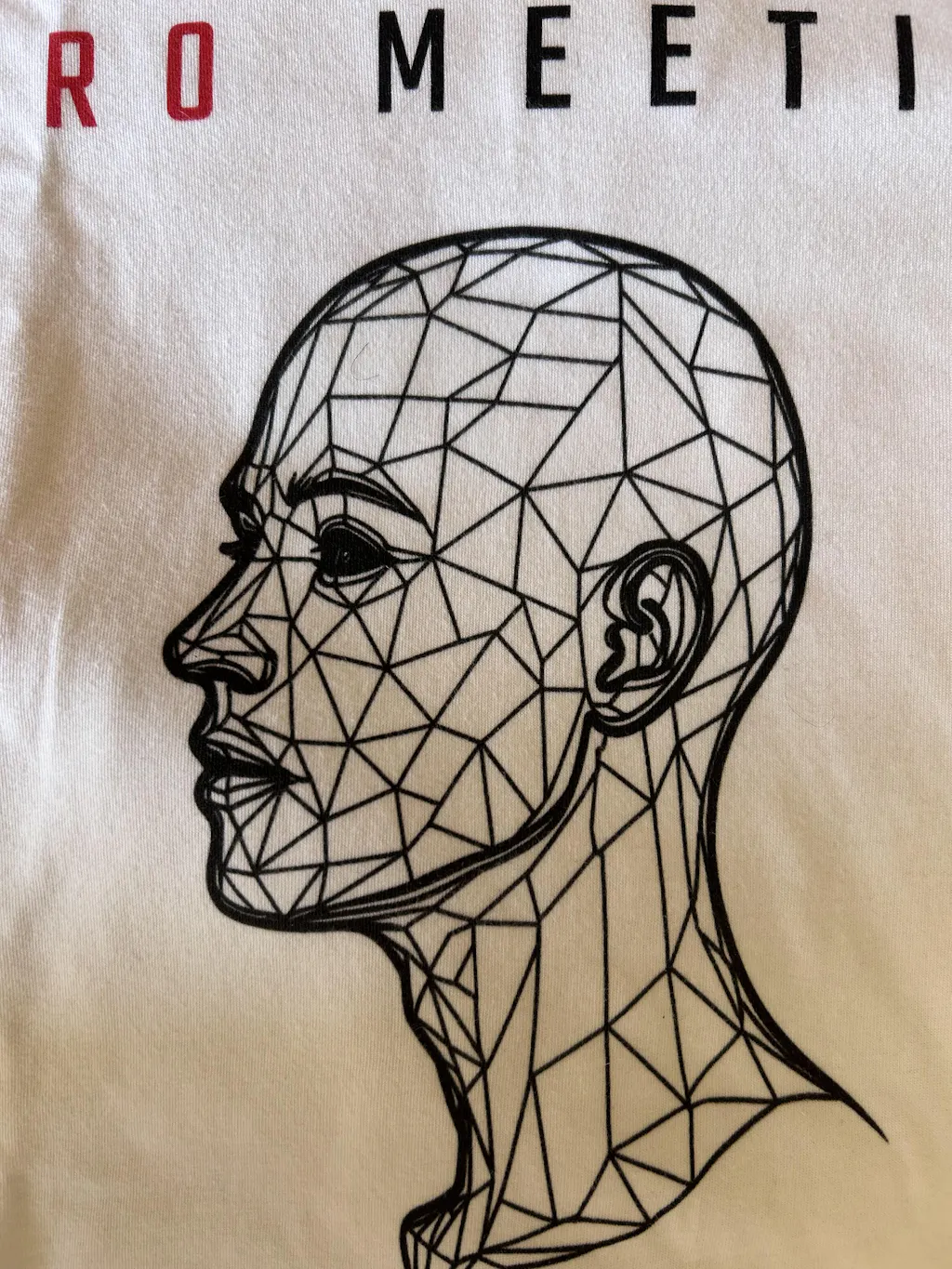
- Zero Meetings Max Output: for protecting deep work
Browse more in Engineer T-Shirts.