A Quality Graphic Tee Guide for Engineers
Teilen
The shirt looked good on the product page. Then it arrived with a thin collar, a print that felt like laminated plastic, and a joke so generic it could have been written by someone who thinks a caliper is a type of dog. This quality graphic tee guide is for people who inspect parts, review drawings, run machines, close CAPAs, and expect their clothing to meet a reasonable spec too.
A good graphic tee is not complicated, but it is not accidental. The blank has to wear well. The print has to stay readable. The reference has to be accurate enough that the right people get it without a paragraph of explanation. If one of those fails, you have novelty apparel. Not a shirt you reach for on Friday, at a trade show, or during another meeting that should have been an email.
Start With the Garment, Not the Graphic
The design gets the attention, but the garment determines whether the shirt stays in rotation. A sharp root cause analysis graphic cannot compensate for fabric that twists after two washes or a neckline that turns into a bacon-strip simulation.
For a dependable everyday tee, look for a fabric weight that has enough body to hold its shape without feeling like PPE. Midweight cotton is usually the practical range. Lightweight shirts can feel good in hot shops or summer weather, but they tend to show wear faster and may drape poorly depending on the cut. Heavier tees feel more substantial and often last longer, though they can be too warm under a hoodie or in facilities where the ambient temperature is already doing its best impression of a furnace.
Cotton matters because it is breathable, familiar, and generally easy to care for. Ring-spun cotton typically has a smoother hand than basic open-end cotton, which helps both comfort and print appearance. Organic cotton can be a strong choice for buyers who care about fiber sourcing, but the label alone is not a quality certificate. Construction, fabric weight, shrinkage control, and print execution still determine whether it performs.
Blends deserve a practical assessment. A small amount of polyester can improve shape retention and reduce drying time. It can also change the feel, increase heat retention, and complicate some print methods. There is no universal best material. The right choice depends on where you wear it, how you wash it, and whether you prefer broken-in softness or a more structured feel.
Check the construction details
Look closely at the collar, shoulder seams, and side construction. A ribbed collar with decent recovery is not glamorous, but it is one of the first things you notice when a shirt starts failing. Reinforced shoulder seams help a tee keep its form. Side-seamed construction often produces a more consistent fit than tubular blanks, although a well-made tubular shirt can still work.
Fit is also a functional specification. A shirt that is too slim restricts movement and clings in all the wrong places. One that is too boxy can look careless, especially when the graphic is centered on a large field of fabric. Check the size chart instead of assuming your usual size translates across brands. Engineers already know that nominal dimensions and actual dimensions are different things.
A Quality Graphic Tee Guide to Print Methods
A print should feel like part of the garment, not a warning label attached to the front. The best method depends on artwork, fabric, order volume, and intended finish. Anyone claiming one process wins every time is selling a process, not evaluating the application.
Screen printing remains a strong option for bold artwork and solid colors. Done well, it produces durable prints with sharp edges and repeatable results. The trade-off is that heavy ink coverage can create a thicker hand feel, especially on dark shirts. Water-based inks can feel softer because they absorb into the fabric, though results vary by fabric color and composition.
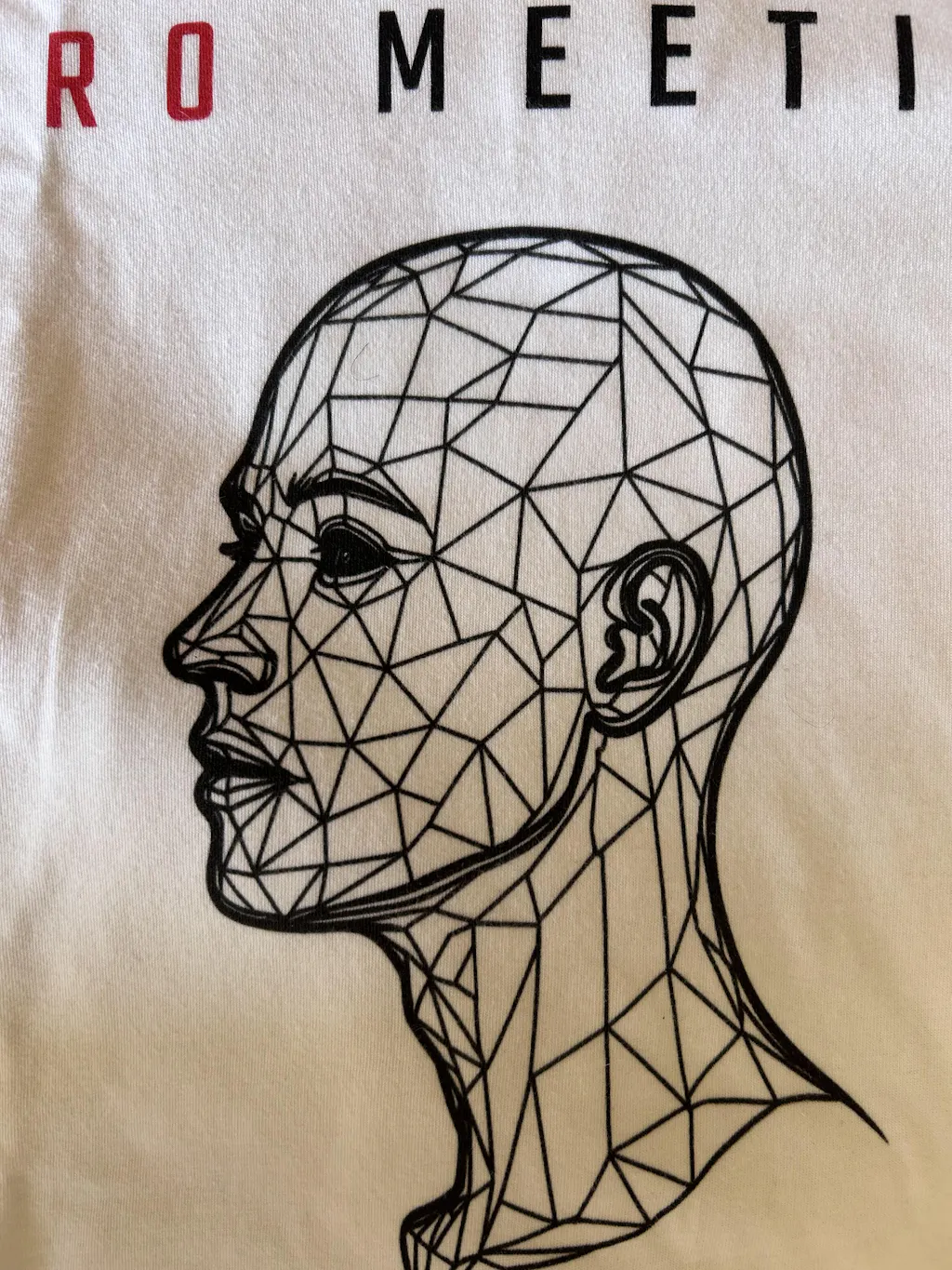
Direct-to-garment printing is useful for detailed artwork, gradients, and smaller production runs. It can reproduce fine line work that would make a multi-screen setup inefficient. Quality depends heavily on pretreatment, curing, garment preparation, and the operator’s process control. A detailed CAD-inspired illustration should not lose its linework after a few wash cycles because somebody treated cure time as a suggestion.
Heat-applied transfers have improved considerably, but quality varies widely. They can be excellent for certain full-color designs and short runs. The risk is a plastic feel, poor edge adhesion, or cracking if the transfer and application settings are not matched to the garment. Judge the finished result, not the marketing term used for the method.
For engineer-focused graphics, detail matters. Small type must remain legible. Fine geometry should not fill in. Lines need enough weight to survive the print process and normal washing. A microscopic tolerance callout may be funny on a monitor, but if nobody can read it from normal conversational distance, it is decoration rather than communication.
The Reference Has to Pass Review
The best technical apparel does not explain the joke. It trusts the wearer and the people who have been there. A CAPA reference, a surface finish callout, a machine setup complaint, or a dry nod to revision control works because it reflects actual work culture.
That does not mean every design needs to be obscure. The point is precision. Generic "engineering is my superpower" copy is not insider humor. It is corporate break-room art with a different font. A stronger graphic finds the tension engineers recognize: the drawing that was theoretically complete, the root cause that was not root enough, the fixture that became permanent after being called temporary for three years.
Accuracy is part of respect. If a design uses technical symbols, abbreviations, dimensions, or manufacturing references, they should be correct or deliberately wrong for a clear reason. The audience will notice. That is not a problem. That is the entire point.
At grabNade, the standard is simple: designs should make sense if you have been there. The reference should feel earned, not borrowed from a search result.
Read the Product Specs Like You Read a Print
A product page cannot tell you everything, but it should provide enough information to make a decision without guessing. Start with fiber content and garment weight when available. Then check the fit description, size chart, care instructions, and printing details. Vague claims such as "premium quality" are not specifications.
Photos help, but they can hide the things that matter most. Look for close-ups of the print, collar, and fabric texture. If every image is heavily filtered or shows only a perfectly folded shirt, you are missing useful evidence. A good seller should be comfortable documenting what the product is made from and how it is expected to wear.
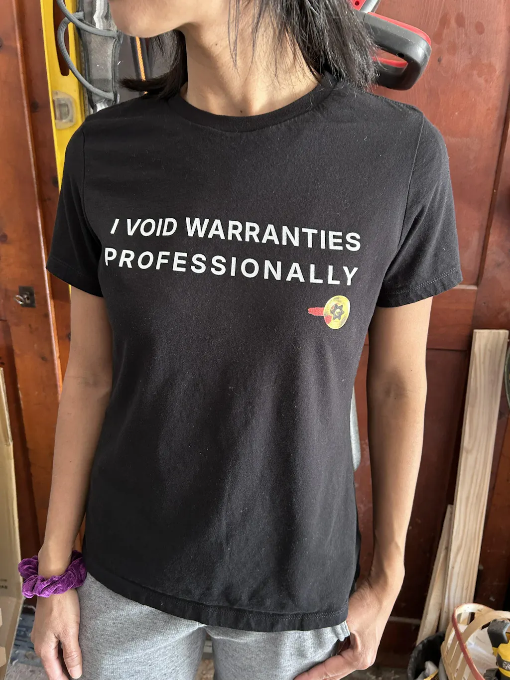
Color deserves some restraint. Screen colors, lighting, and garment dye lots can shift perception. Black is usually forgiving and keeps line art crisp. Heather colors can add softness and visual texture, but the flecked fabric may reduce contrast on fine details. Bright ink on a dark shirt can look excellent, provided the print has enough opacity and the design was built for that substrate.
Price is information, not proof. A lower-priced tee may be completely adequate for an occasional gift or event. A higher-priced shirt may reflect better blanks, lower-volume production, more complex print work, or simply brand positioning. Compare the stated materials and construction before assuming either one is a bargain or a rip-off.
Make It Last Past the First Wash Cycle
Most print failures are not mysterious. Heat, friction, harsh chemistry, and aggressive drying do their work with impressive consistency. Turn graphic tees inside out before washing. Use cold water when practical, avoid bleach on printed areas, and skip the hottest dryer setting. Air drying is gentler on both fabric and print, though it is not mandatory for every shirt.
Do not iron directly over the graphic. If the shirt needs attention, turn it inside out or place a pressing cloth between the iron and the print. This is basic process discipline, not fashion ritual.
Expect some change over time. Cotton softens. Dark colors can fade gradually. A soft-hand print may wear in differently than a thick ink print. The goal is not zero change forever. The goal is controlled aging: a shirt that still fits, reads clearly, and looks intentional after real use.
A quality tee earns its place the same way good tooling does. It works without demanding attention, holds up under normal abuse, and makes the people who understand it give a small nod. Buy the one with a proper spec, an accurate reference, and enough substance to survive more than the product photo.
Designs for quality and spec-minded engineers
- Root Cause CAPA Approved: here for the root cause, not the excuses
- QA Compliance Mantra: define it, control it, document it
- Ra 3.2 vs Rz 16: for metrology people
Browse more in Quality Engineer T-Shirts.