What Technical Graphic Apparel Gets Right
Teilen
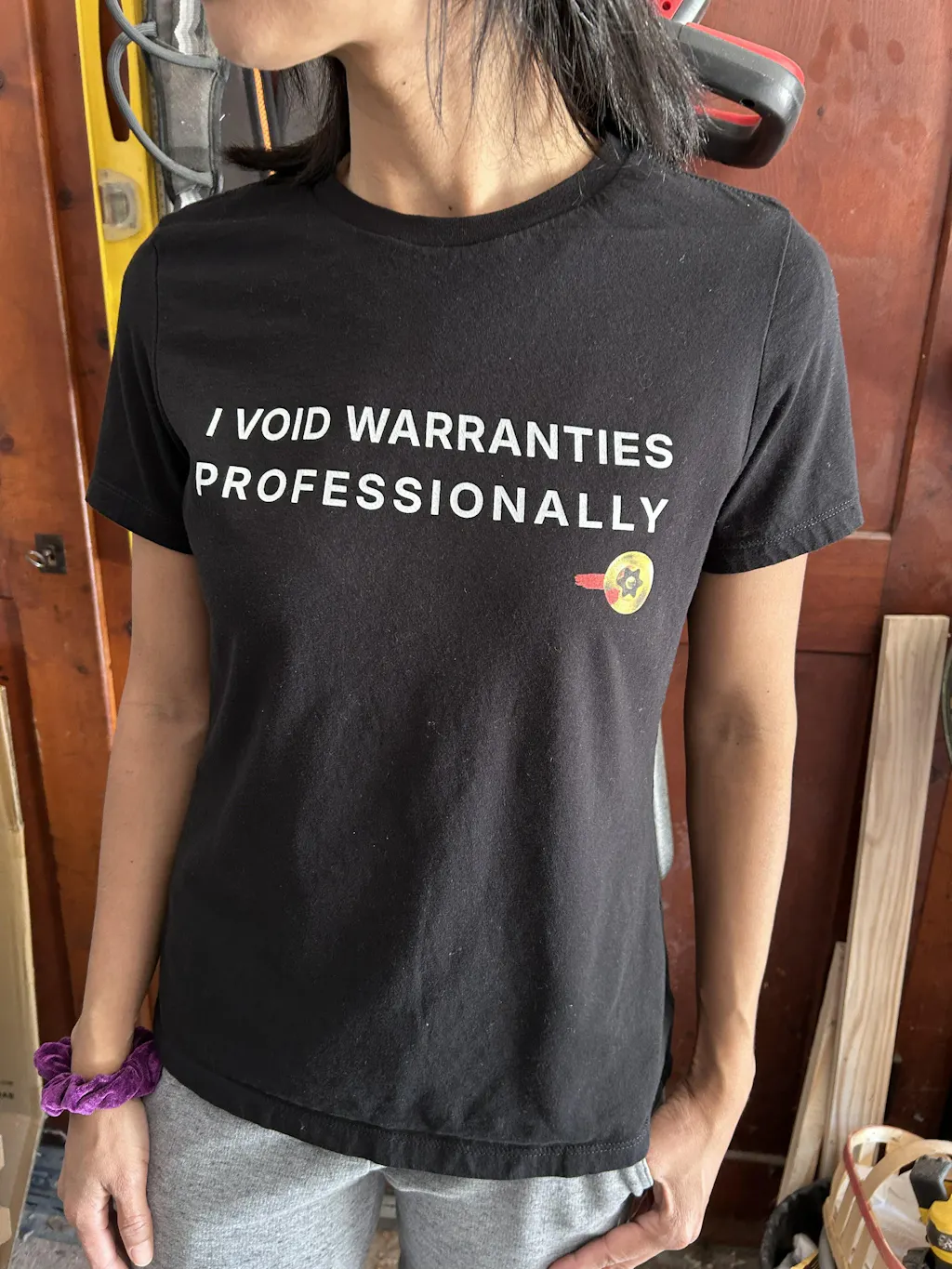
Most engineer shirts fail the sniff test in about three seconds. The joke is off, the drawing is wrong, the reference is watered down for everyone, and the shirt itself feels like it came from a bargain bin. That is the gap technical graphic apparel is supposed to close.
If it is done right, it does more than put a print on cotton. It signals that the person who made it actually knows the difference between a machining joke and a CAD joke, between quality culture and startup cosplay, between a design that lands in the lab and one that gets an eye roll in the break room. That distinction matters more than most apparel brands seem to realize.
Why technical graphic apparel exists at all
Most niche workwear-adjacent apparel starts with identity. People want to wear something that reflects what they do without looking like they lost a bet. Engineers, machinists, and quality people are no different. They want gear that feels specific enough to mean something and clean enough to wear outside the shop.
Generic STEM merch usually misses because it treats technical work like a broad personality type. It assumes every engineer wants atom icons, binary code, or a recycled joke about being bad at socializing. That is not insider culture. That is mass-market approximation.
Technical graphic apparel works when it starts from the opposite direction. It begins with real shop language, real process pain, real standards, real humor, and the weirdly specific moments that only make sense if you have actually sat through the CAPA review, argued over tolerances, chased root cause, or spent too long trying to explain why the print and the part do not match.
That is the real product. The shirt or hoodie is just the delivery method.
What separates real technical graphic apparel from novelty merch
The first difference is reference quality. A good technical design does not just mention engineering. It says something true about engineering work. That truth can be funny, blunt, slightly painful, or quietly clever, but it has to be accurate.
Accuracy matters because this audience notices everything. If a machining term is used wrong, if a diagram is visually sloppy, or if a quality reference sounds like it was generated by someone who has never seen a nonconformance report, the design is dead on arrival. Technical people are forgiving about plenty of things. Fake fluency is not one of them.
The second difference is restraint. Good technical apparel does not need to scream. In fact, the more niche the reference, the less it needs oversized graphics and forced punchlines. A subtle design often performs better because it feels earned. It creates recognition instead of begging for attention.
The third difference is the blank itself. This is where a lot of brands lose credibility. If the design is aimed at people who care about material specs, durability, and process control, then the garment cannot feel disposable. Fabric weight, print quality, shrink behavior, collar recovery, and construction details are not side issues. They are part of the evaluation.
A technically literate customer will absolutely notice if the shirt twists after washing, pills too fast, or prints like a stiff vinyl rectangle. That does not mean every piece has to be heavyweight or overbuilt. It means the garment choice should make sense for the use case.
The design standard is higher than people think
Technical audiences are unusually good at spotting lazy work. That comes with the territory. If your day job involves inspection criteria, drawing review, process improvement, debugging, fit-up, or design revision, you do not suddenly stop noticing details because the object is a t-shirt.
That is why technical graphic apparel has to clear a higher bar than standard novelty clothing. The design has to function on at least three levels at once. First, it needs to be visually solid. Second, it needs to be factually credible. Third, it needs to feel socially wearable.
That last part gets ignored. A shirt can be extremely accurate and still fail if it looks too loud, too juvenile, or too online. Most professionals are not looking for costume wear. They want something they can throw on at a plant cookout, trade show, airport, brewery, or weekend errand without feeling like a walking meme.
Wearability is a technical requirement, not just a style preference.
Where technical graphic apparel usually goes wrong
The most common failure is overexplaining the joke. If a design has to spell everything out, it loses the insider effect. The best references trust the audience. They assume competence.
Another failure is confusing complexity with authenticity. A shirt covered in equations, callouts, and pseudo-industrial graphics is not automatically better. Sometimes it looks like someone tried to cram an entire whiteboard onto a chest print. More detail is not the same as more meaning.
Then there is category confusion. Some brands cannot decide whether they are making workwear, fan merch, or internet humor. Those are different products. Technical graphic apparel can borrow from all three, but it needs a clear center. If the design language is too broad, it stops feeling specific. If it is too inside-baseball, it narrows the audience to six people in one department.
That trade-off is real. Not every reference should be hyper niche. Some designs should hit a wider engineering audience, while others should speak directly to machinists, quality engineers, manufacturing people, or R&D teams. The smart move is not choosing one forever. It is building a range with intentional levels of specificity.
Technical graphic apparel and garment quality
This is the part fashion-first brands often underestimate. For this audience, quality claims are not decoration. If you say a shirt is premium, people want to know what that actually means.
They are looking at fabric composition, weight, print method, and how the piece holds up after repeated washes. They care whether the hoodie keeps its shape, whether the women’s tee is actually cut well instead of being an afterthought, and whether organic apparel still meets performance expectations instead of trading durability for marketing language.
There is no universal best choice here. A lightweight shirt can be the right call for hot climates or daily layering. A heavier blank might make more sense for buyers who want more structure and longer-term durability. Water-based printing may feel softer, while other methods may offer advantages depending on the artwork and fabric. The point is not that one spec wins every time. The point is that the decisions should be deliberate and explained clearly.
That is where a brand with real technical instincts stands out. If the product page reads like someone actually thought through materials, tolerances, and use conditions, trust goes up fast.
Why insider references matter more than broad appeal
Broad appeal is overrated in this category. The entire reason technical apparel exists is that broad appeal failed. Engineers do not need another shirt trying to be universally relatable. They need one that makes sense if you have been there.
That might mean a design built around root cause analysis, surface finish, revision chaos, tolerance stacking, nonconformance fatigue, or machine shop logic. These references are not random decoration. They are cultural markers. They say, clearly, this was made by somebody who knows the work.
That credibility is also why technical apparel makes unusually good gifts. When a spouse, friend, or teammate finds a design that actually matches the recipient’s world, it feels personal instead of generic. The shirt is funny or sharp because it is accurate, not because it has a cartoon wrench on it.
For a brand like grabNade, that is the whole lane. Not engineer-themed for everyone. Apparel for people who can tell the difference.
What buyers should look for in technical graphic apparel
Start with the design itself. Ask whether the reference is real, specific, and visually clean. If it feels like a generic joke with a few industry words pasted in, move on.
Then look at garment transparency. You should be able to tell what the item is made from, how it fits, and what kind of print or construction you are paying for. Vague quality language is a red flag.
Finally, consider how the piece fits into actual life. Some shirts are best for the shop, some for weekends, some for casual office wear, and some for gifting. The strongest designs can move across those settings without feeling forced.
That balance is harder than it looks. Too subtle, and the design loses character. Too loud, and it loses repeat wear value. The sweet spot is a piece that gets recognized by the right people and still works as clothing, not just commentary.
Technical graphic apparel earns its place when it respects both halves of the equation - technical and apparel. One without the other is how you end up with a smart idea printed on a bad shirt, or a nice shirt carrying a fake reference. The good stuff does not ask you to settle for either. It just makes sense when you see it, which is usually how the best engineered products work too.