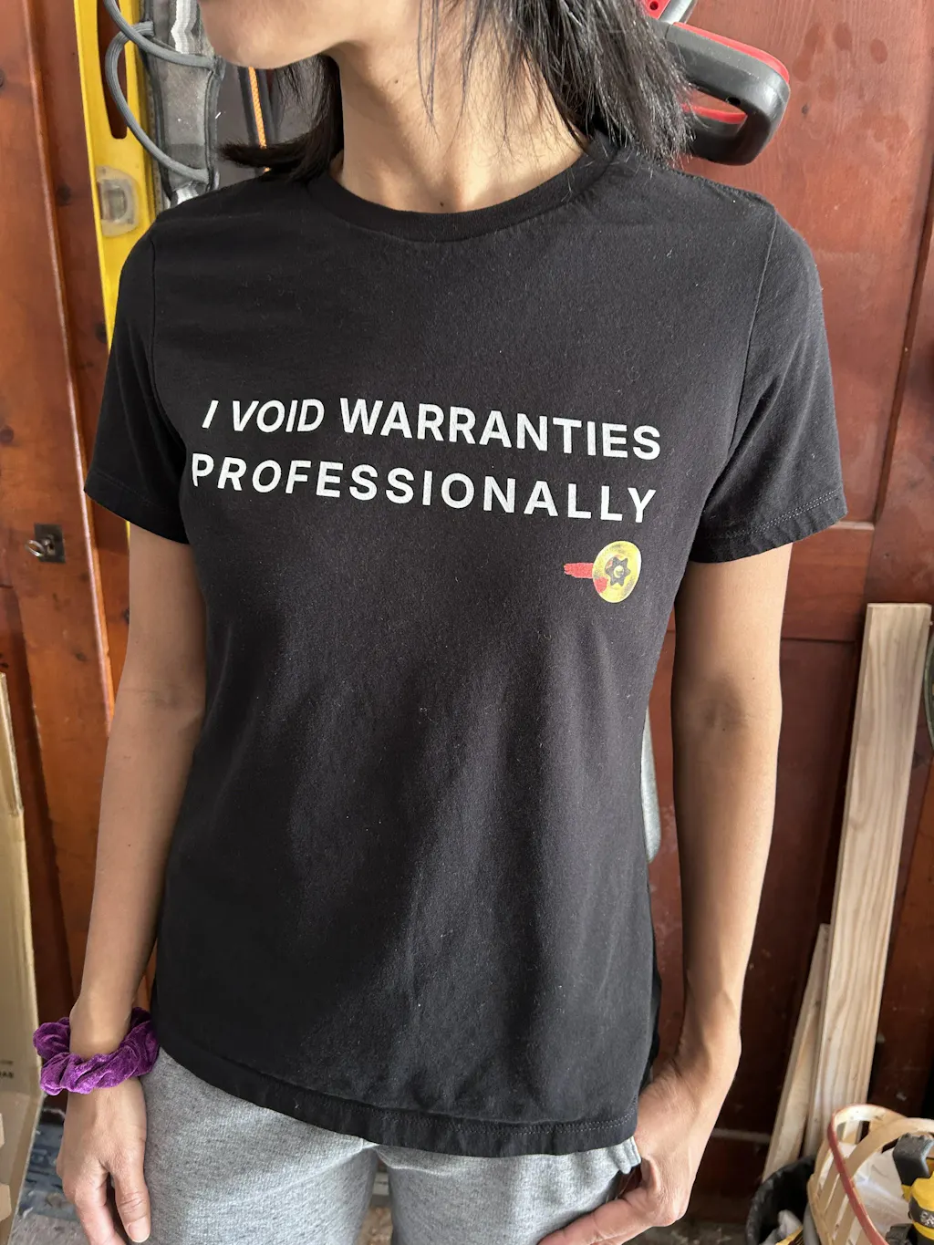
How to Spot Cheap Graphic Apparel Before You Buy
Dela
A shirt can look great in a product photo and still arrive feeling like a disposable shop rag with a slogan on it. Knowing how to spot cheap graphic apparel means looking past the punchline, the mockup, and the sale price. The useful clues are usually hiding in plain sight: garment specs, print choices, construction details, and what the brand is willing to say when nobody is asking.
For engineers, machinists, quality people, and anyone who notices when tolerances are sloppy, this is familiar territory. A graphic tee is still a manufactured product. Inspect the inputs, understand the process, and do not confuse a clean render with a controlled outcome.
How to Spot Cheap Graphic Apparel in the Specs
The fastest way to separate a serious garment from a low-effort novelty shirt is to read the product description. Not the paragraph about how the design will "turn heads." Read the actual specifications.
Fabric composition comes first. A 100% cotton shirt is not automatically better than a blend, but vague language is a warning sign. If a listing only says “soft tee” or “premium cotton” without identifying the fiber content, garment weight, or blank style, you are being asked to buy on faith. That is rarely a quality protocol.
Cotton can be durable, breathable, and comfortable, especially when it has enough body. Ringspun cotton generally has a smoother hand than basic open-end cotton, while combed ringspun cotton has had shorter fibers removed for a cleaner, softer result. Those are useful signals, not magic words. A lightweight ringspun tee may be ideal for summer or layering, but it will not feel as substantial as a heavier shirt.
Blends deserve the same practical evaluation. Cotton-polyester blends can resist shrinking, dry faster, and hold their shape well. Tri-blends often feel exceptionally soft and drape more easily, but they are usually lighter and may not be the right choice if you want a structured workshirt feel. The question is not whether one construction wins on paper. The question is whether the brand tells you what you are getting and why it chose it.
Garment weight, often shown in ounces per square yard, gives you another data point. It does not define quality by itself, but it helps set expectations. Very light fabric can be comfortable, yet it is more likely to feel thin, twist after washing, or show through under bright light. A heavier garment often feels more durable, though it can run warmer and may not have the same soft drape. Anyone claiming one weight fits every use case is selling a shortcut.
Inspect the Print Like It Has a Failure Mode
Graphic apparel lives or dies at the print. Cheap shirts often fail because the artwork was treated as an afterthought: an oversized design, a poor file, the wrong print process, or an operator trying to force detail out of a method that cannot hold it.
Start with the artwork itself. Fine lines, small type, halftones, and technical drawings demand clean execution. If the product image makes lettering look fuzzy, jagged, or swollen, do not assume it will sharpen up in person. Look closely at line spacing and negative space. On a well-executed print, small details remain intentional rather than closing into a dark blob.
Then consider coverage. A large solid rectangle of ink across the chest can feel stiff, hot, and plastic-like, especially on a lightweight shirt. That does not mean large prints are always bad. Screen printing can produce durable, vivid color, and some designs need a strong ink layer. But the design should justify the process. A subtle shop-floor reference or precise CAD-style linework usually benefits from a print that preserves detail and keeps the garment wearable.
Direct-to-garment printing can handle full-color artwork and nuanced shading well, particularly on suitable cotton garments. Its quality depends heavily on the pretreatment, the equipment, the artwork, and curing discipline. Heat transfers can also look excellent when produced properly, but low-grade transfers are easy to recognize: thick edges, a glossy plastic finish, limited stretch, and cracking after a few wash cycles.
A reliable product page should make the print look like part of the garment, not a sticker placed on top of it. Check customer photos when available, but use judgment. Some people photograph shirts under bad lighting. What matters is whether multiple images show a print sitting smoothly on the fabric with consistent color and crisp registration.
The stretch check matters
If you have the shirt in hand, gently stretch the printed area. A good print should flex with the fabric without immediately showing fractures, gaps, or a stiff film separating from the shirt. Do not pull it like you are proof-testing a weld. Just enough tension to reveal whether the ink has reasonable elasticity and adhesion.
Also run a hand over the graphic. A print with some texture is normal. A heavy, rubbery slab over a large area is less promising, especially if the garment itself is thin. The shirt and graphic need to work as an assembly.
Look at Construction, Not Just the Front
Cheap graphic apparel often spends its entire budget on the front mockup. Turn the garment around. Check the collar, shoulder seams, side seams, hems, and label.
A collar that feels flimsy or rolls after one wash is a common failure point. Ribbed neckbands should recover rather than stretching into a loose wave. Shoulder seams should sit evenly, and stitching should not be sparse, wandering, or full of loose threads. On tubular tees, you will not see side seams because the body is knit as a tube. That is not automatically a defect. On side-seamed shirts, check that the seams are straight and the body does not look twisted.
Fabric twist, sometimes called torque, is another useful tell. After washing, a low-quality tee may rotate so the side seam creeps toward the front. Some movement can happen with cotton, but severe twisting points to poor fabric control or cutting. You should not need a coordinate measuring machine to find the centerline of your own shirt.
Pay attention to hems as well. A badly finished sleeve or bottom hem can pucker, flip upward, or lose its shape early. These are not glamorous details, which is exactly why they separate thoughtful apparel from a rushed novelty run.
Treat Sizing Information as Documentation
“Unisex fit” is not a size chart. It is a category label with almost no useful dimensional information.
Trustworthy apparel sellers provide measurements, ideally garment measurements rather than vague body ranges. Chest width and body length are the basics. Sleeve length, shoulder width, and fit notes are even better where relevant. Measurements should explain whether the garment runs slim, standard, relaxed, or oversized.
This matters because cheap apparel frequently uses inconsistent blanks across colors, stock changes, or production batches. The black shirt fits one way, the heather gray one fits another, and the buyer learns about it after opening the package. Transparent sizing does not eliminate variation, but it shows the seller has measured the part instead of guessing.
For women’s tees, this is especially relevant. A women’s cut can mean a shaped, shorter garment, but the label alone says nothing about shoulder width, length, or stretch. If you prefer a straight fit, size from actual garment dimensions, not the number printed on the tag.
Watch for Marketing That Avoids the Actual Product
Words such as “luxury,” “exclusive,” “high quality,” and “premium” are not specifications. They may be true, but they do not tell you anything unless the brand supports them with material details, care instructions, fit guidance, and clear production information.
Be wary when every product uses identical mockups, every design is available on every imaginable item, and no one can explain the garment differences. That setup often signals a broad print-on-demand catalog built around volume rather than a considered apparel program. Print-on-demand is not inherently cheap or bad. It can be a sensible production model. The issue is whether the seller has selected good blanks, prepared art correctly, and maintained consistent expectations.
Price is also an imperfect diagnostic. A $12 shirt may be poor quality, but a $38 shirt can be poor quality with better branding. The better question is whether the product information earns the price. A company that discusses fabric, fit, printing, care, and known trade-offs is giving you evidence. A company that only repeats “premium” is giving you packaging.
Use the Care Label as a Reality Check
Good graphic apparel should come with care guidance that reflects its construction. Most printed tees last longer when washed inside out in cold water and dried on low heat or air dried. High heat is hard on cotton fibers, shrinkage control, and many print systems. That is material behavior, not superstition.
If a brand claims exceptional durability but provides no care information, the claim is incomplete. Even excellent printing has an operating envelope. A shirt worn under a welding jacket, washed with abrasive workwear, and baked in a hot dryer will age differently than one worn to a design review and washed gently. Quality does not mean invincible.
The best apparel brands respect that distinction. grabNade, for example, treats the garment, the graphic, and the technical reference as one product. The joke has to land, but the shirt has to survive enough laundry cycles to remain worth wearing.
Before buying your next graphic tee, spend two minutes reading the specs and looking for evidence of care in the details. The best shirt is not always the heaviest, softest, or most expensive. It is the one whose materials, print method, fit, and intended use make sense together - like a design that passed review for a reason.